Project Role: Logo, Brand Identity, Print & Digital Advertisements
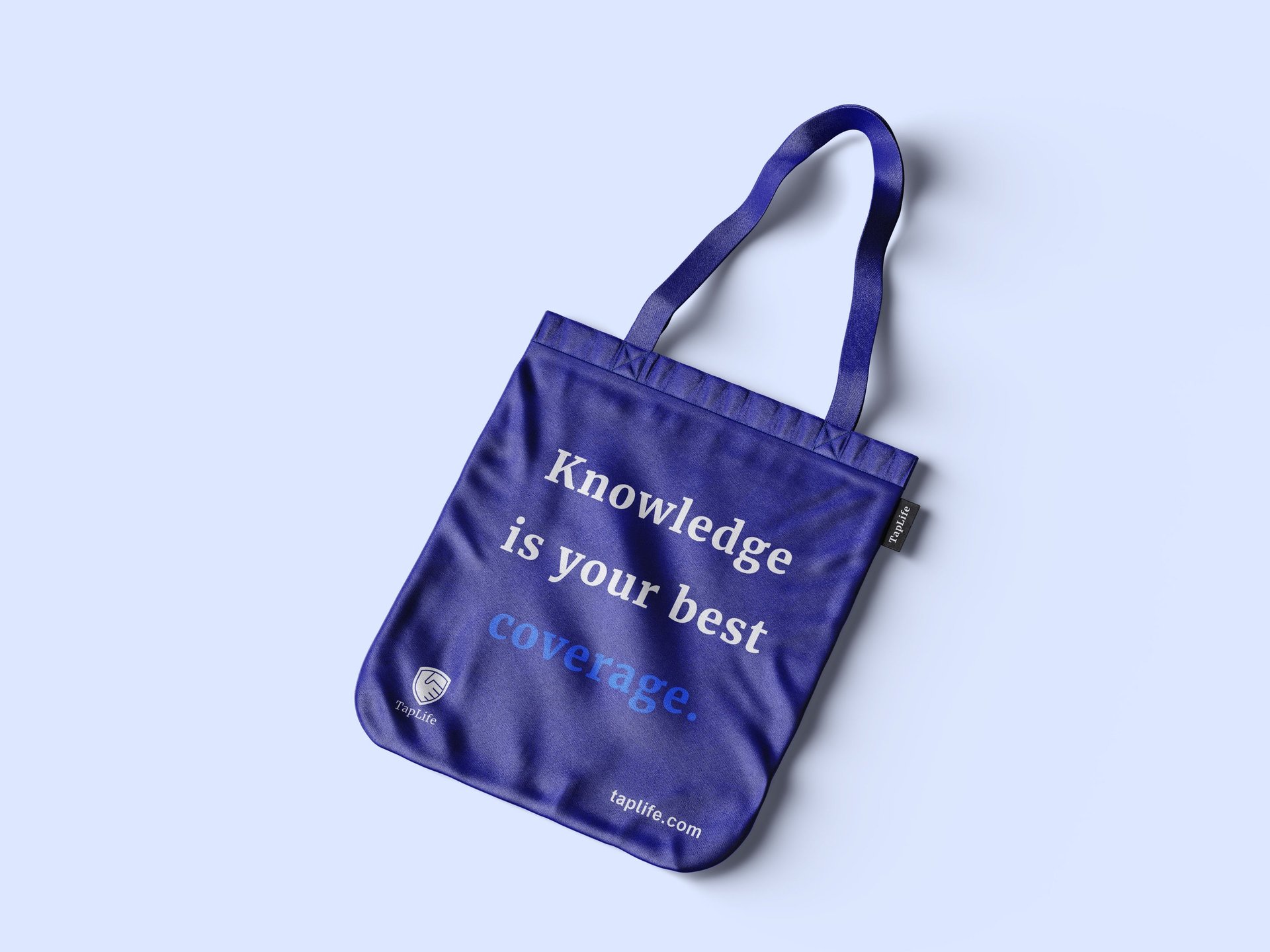
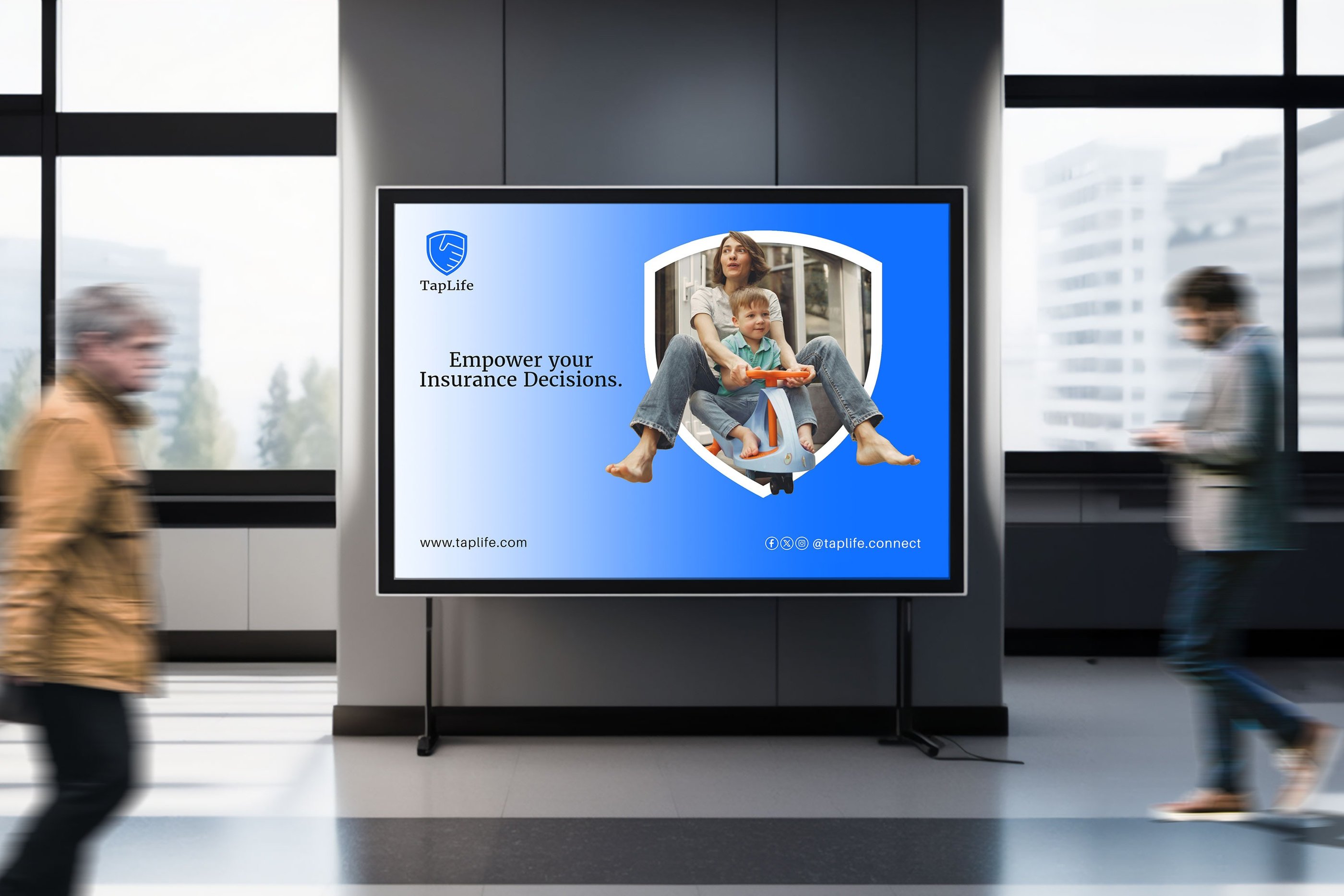
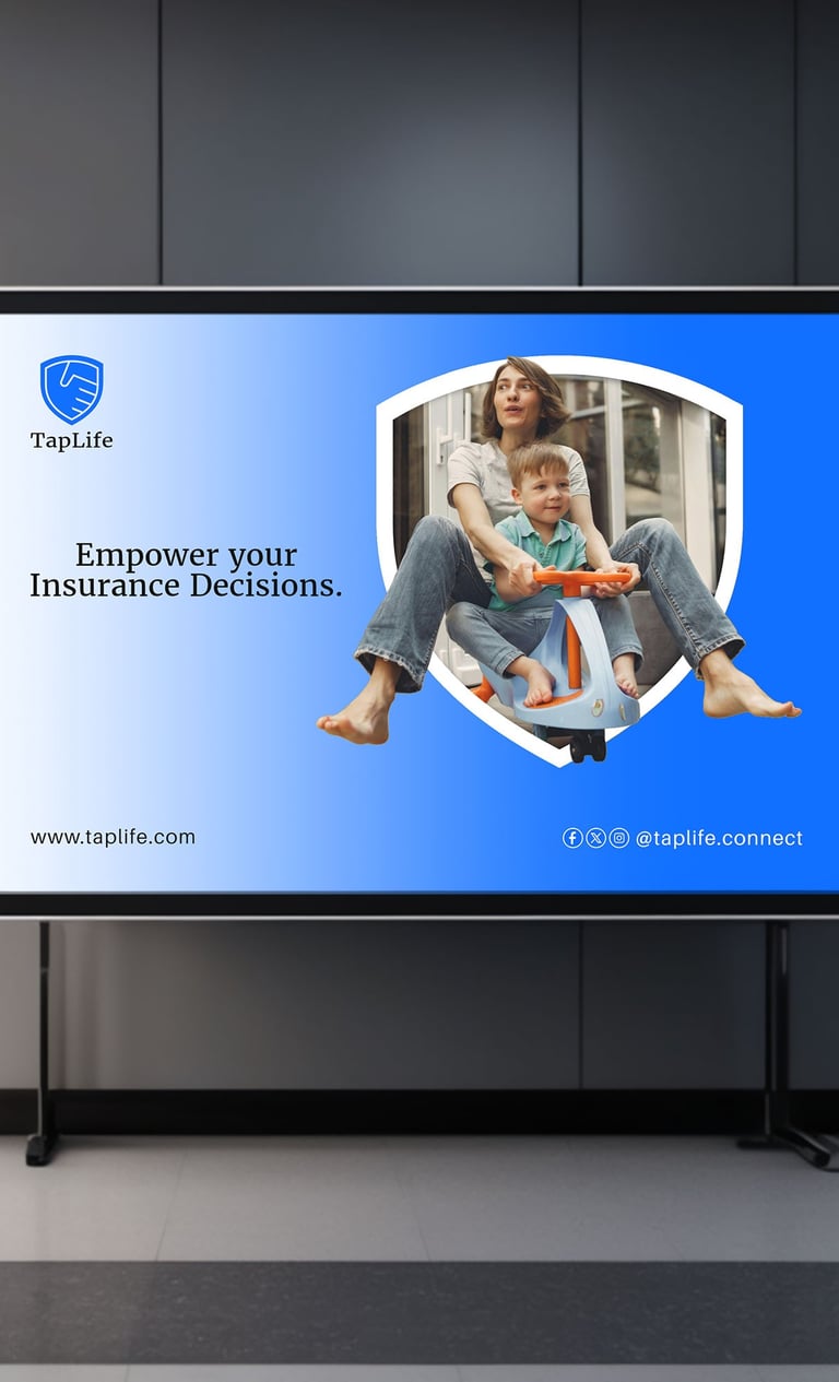
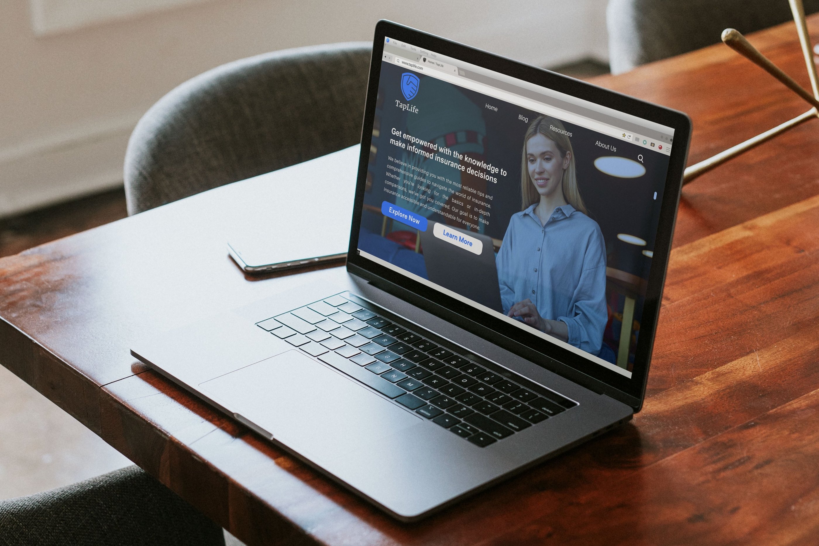
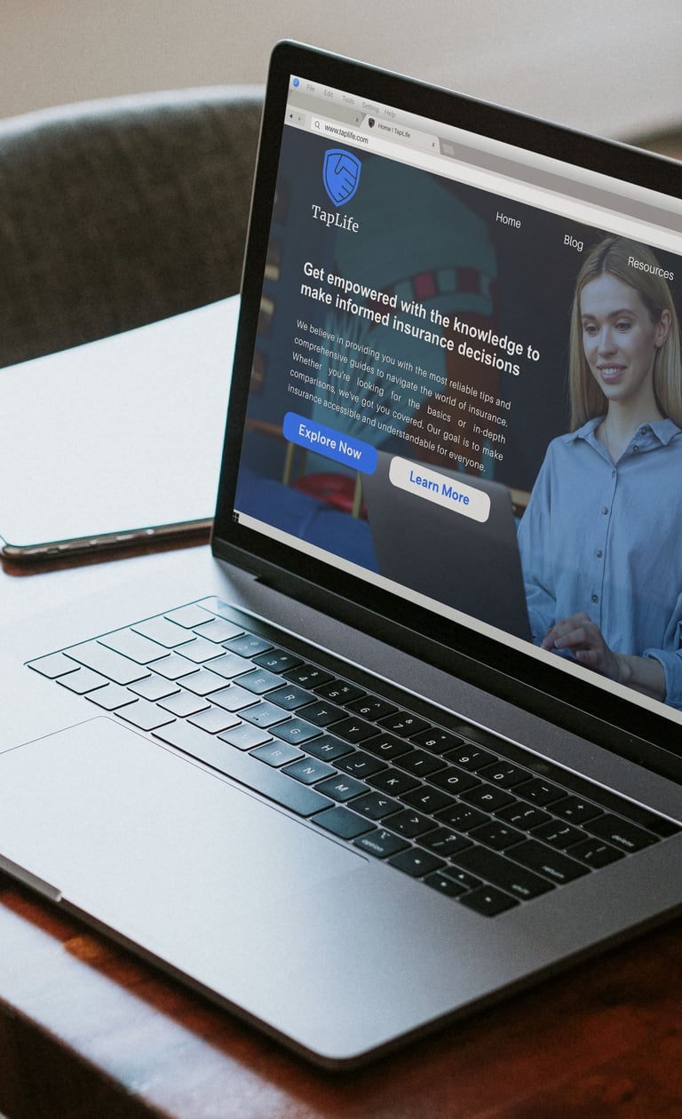
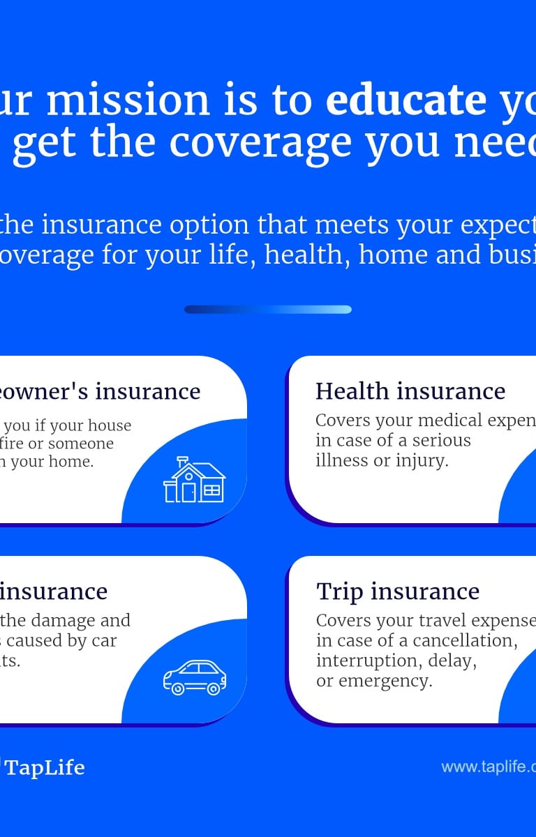
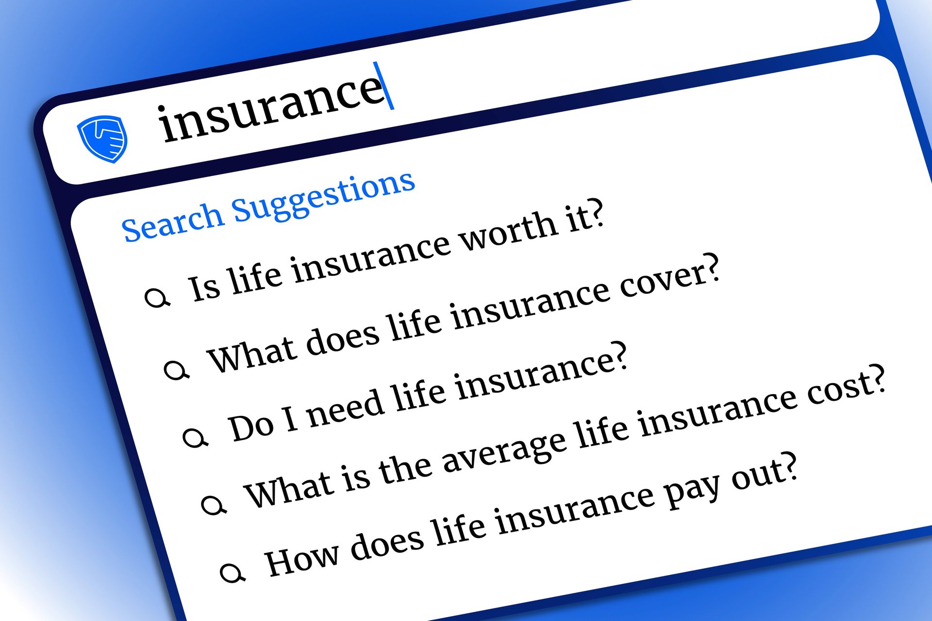
TapLife helps people understand why insurance matters in everyday life. It provides clear, straightforward, and helpful information about various types of insurance, including life insurance, disability insurance, long-term care insurance, and annuities. Whether someone is just getting started or wants to learn more, TapLife is a valuable resource for anyone interested in learning how insurance fits into a brilliant financial plan. No insurance products are sold, and no specific companies are promoted. As a nonprofit organization, TapLife focuses only on sharing honest, fair, and unbiased information. The goal is to help people make informed decisions about protecting themselves and their families. To reach as many people as possible, TapLife shares its message through its website, social media platforms, and news coverage. All content is created to be easy to understand and available to anyone who wants to take control of their financial future with the help of insurance.
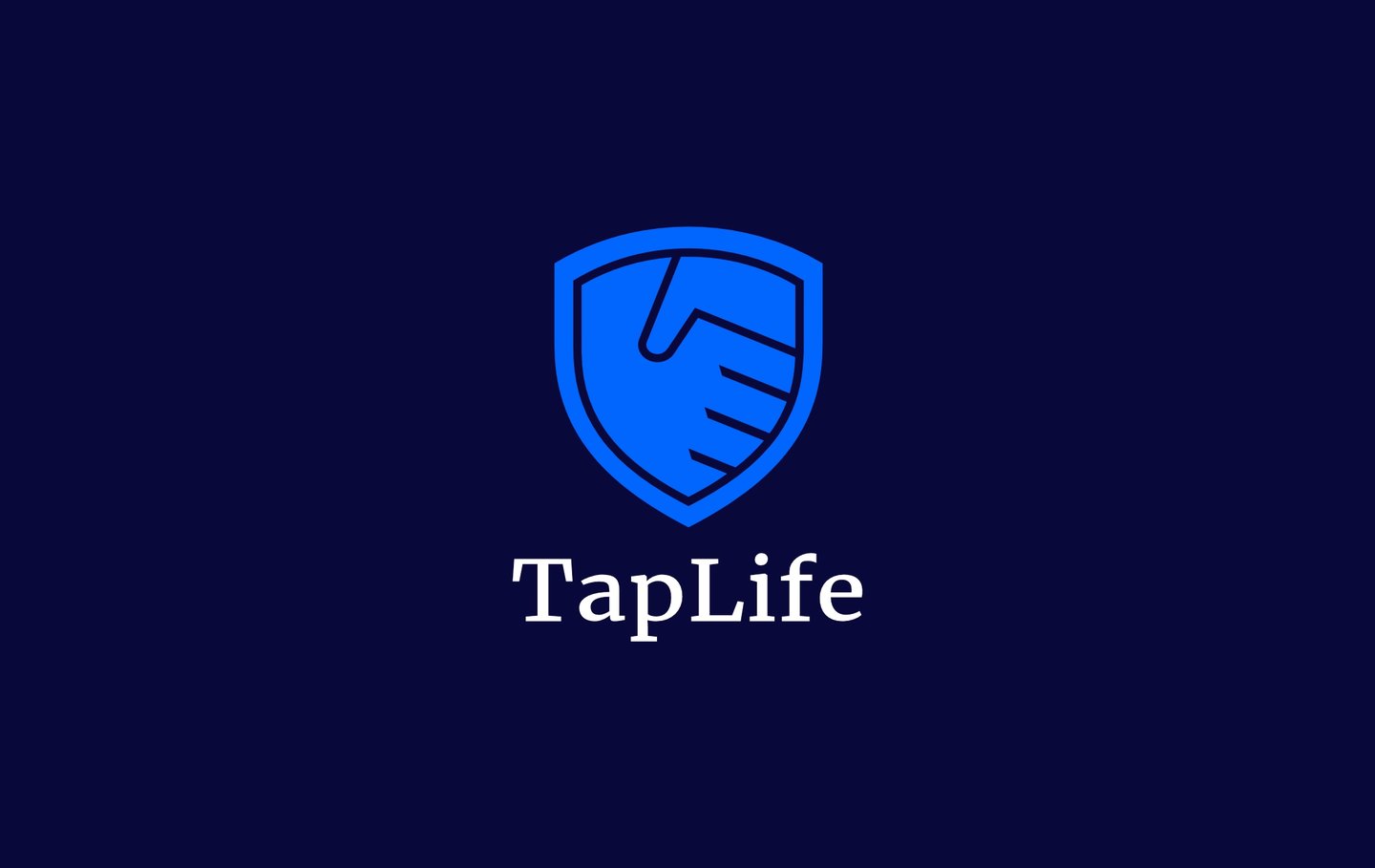
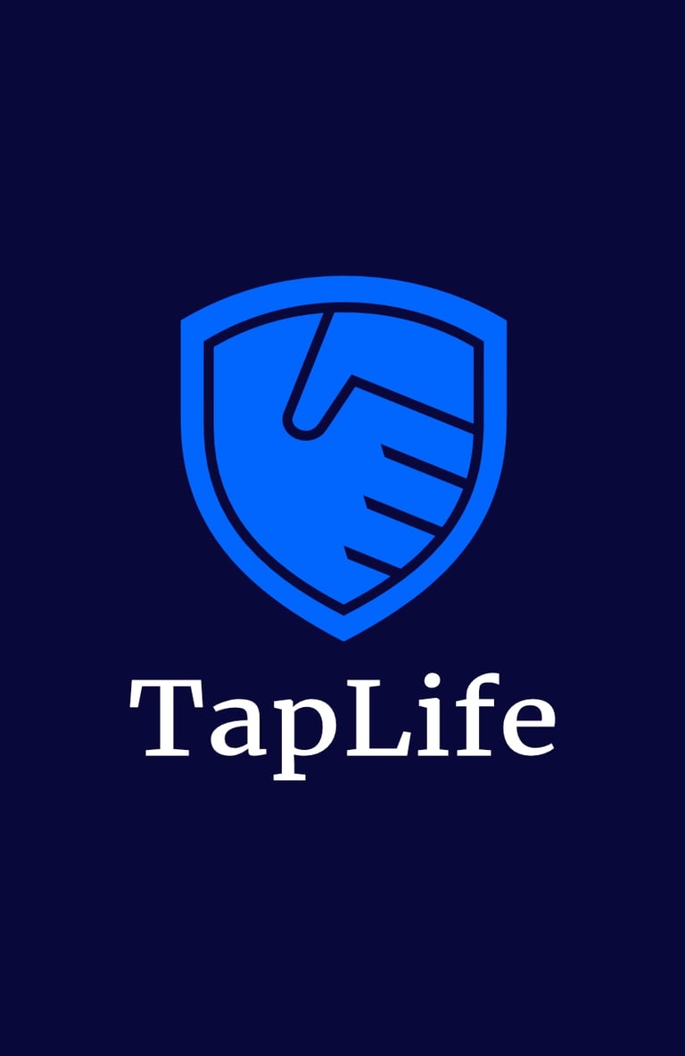
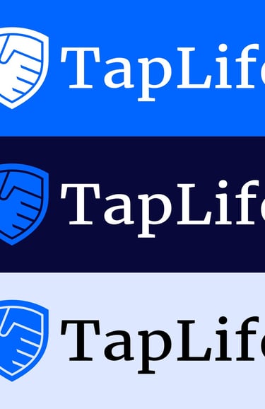
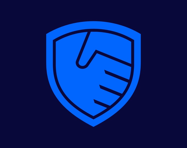
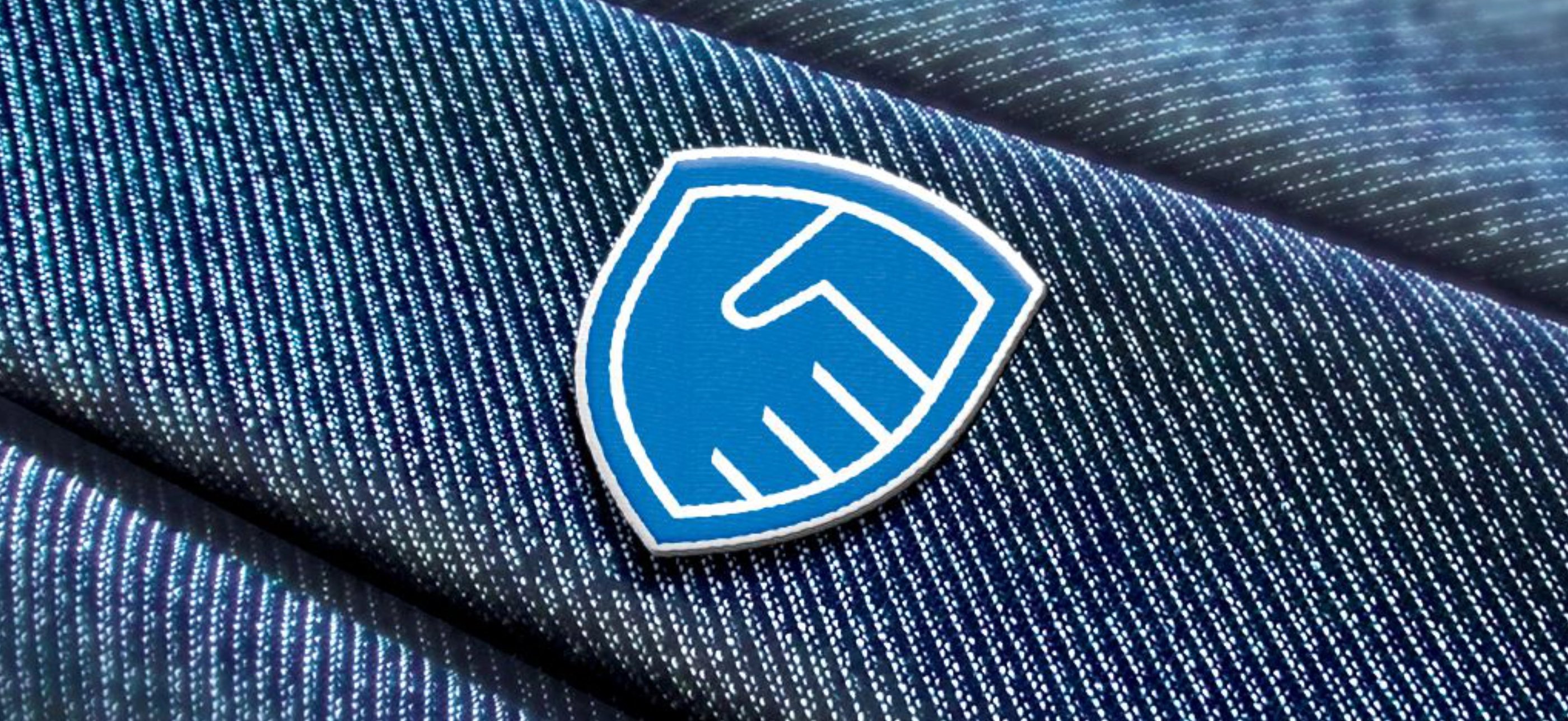
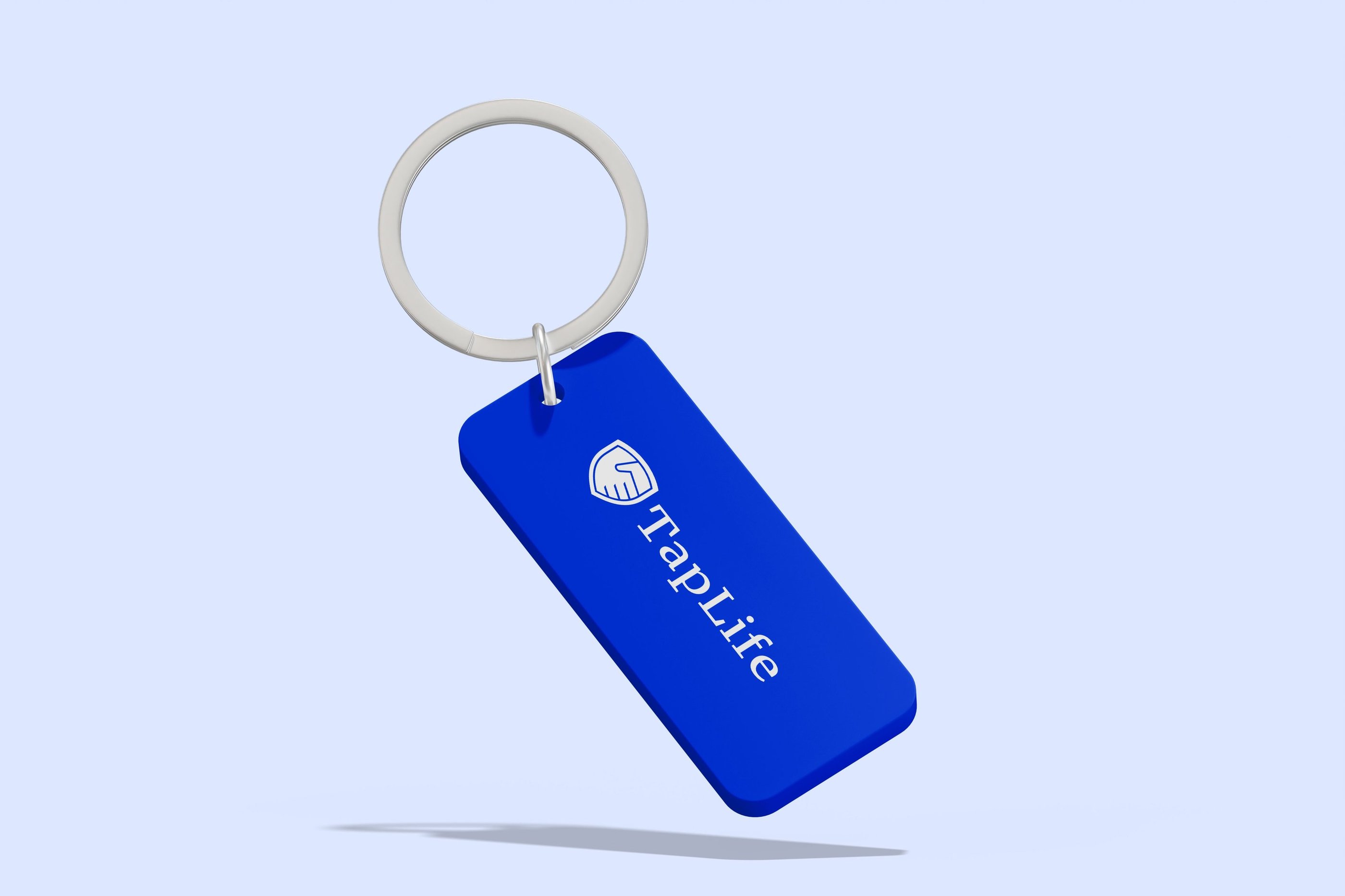
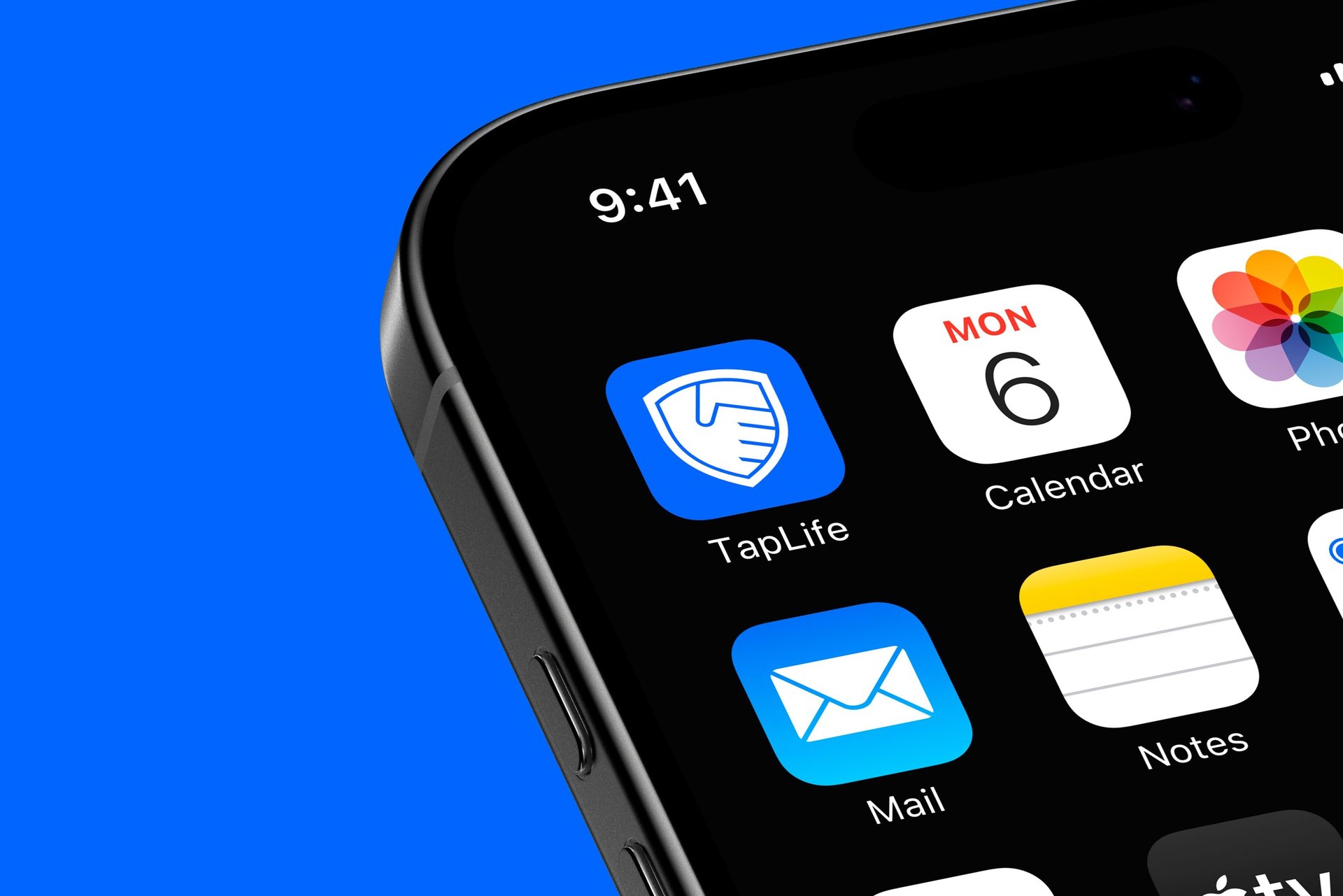
The TapLife logo was carefully designed to show the brand’s commitment to building trust, strength, and a sense of community. The logo features a clean wordmark paired with a unique symbol that combines a shield and a handshake. The shield stands for protection and reliability, while the handshake represents connection, partnership, and mutual support. By combining these two elements into a single, simple design, the logo conveys TapLife’s promise of safety and unity, creating an identity that is meaningful and easy to recognize.
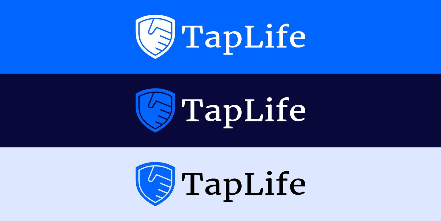
TYPOGRAPHY AND COLOR PALETTE
Merriweather was chosen for its timeless and readable design, combining classic elegance with a modern touch. It reflects the brand’s trustworthy and refined personality. The brand’s color palette was carefully developed to reflect both professionalism and calm confidence. The soft tone of pale baby blue adds a sense of clarity and openness, complemented by the bold and dynamic bright azure, which symbolizes reliability and innovation. These are grounded by rich navy, a color that creates strength, stability, and focus. Together, the palette creates a harmonious visual identity that expresses trust, dedication, and modern sophistication.
Merriweather is a refined serif typeface known for its balance between classic elegance and modern readability. Designed with thoughtful proportions and smooth curves, it brings a sense of trust and sophistication to any visual identity. Its versatility allows it to perform beautifully across digital and print applications, from headlines to body text. Chosen for its warm yet professional character, Merriweather helps the brand communicate clarity, confidence, and timeless appeal.
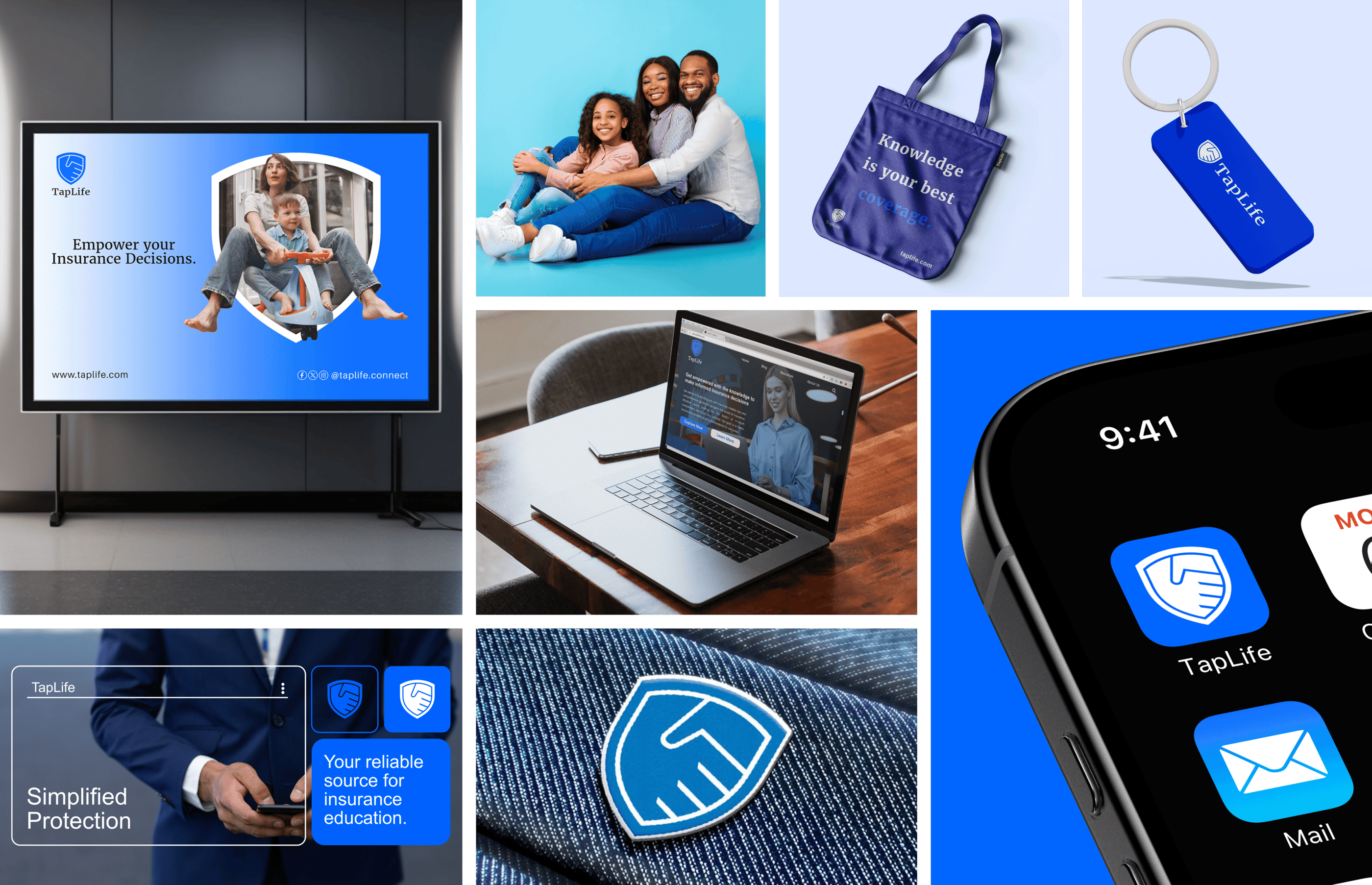
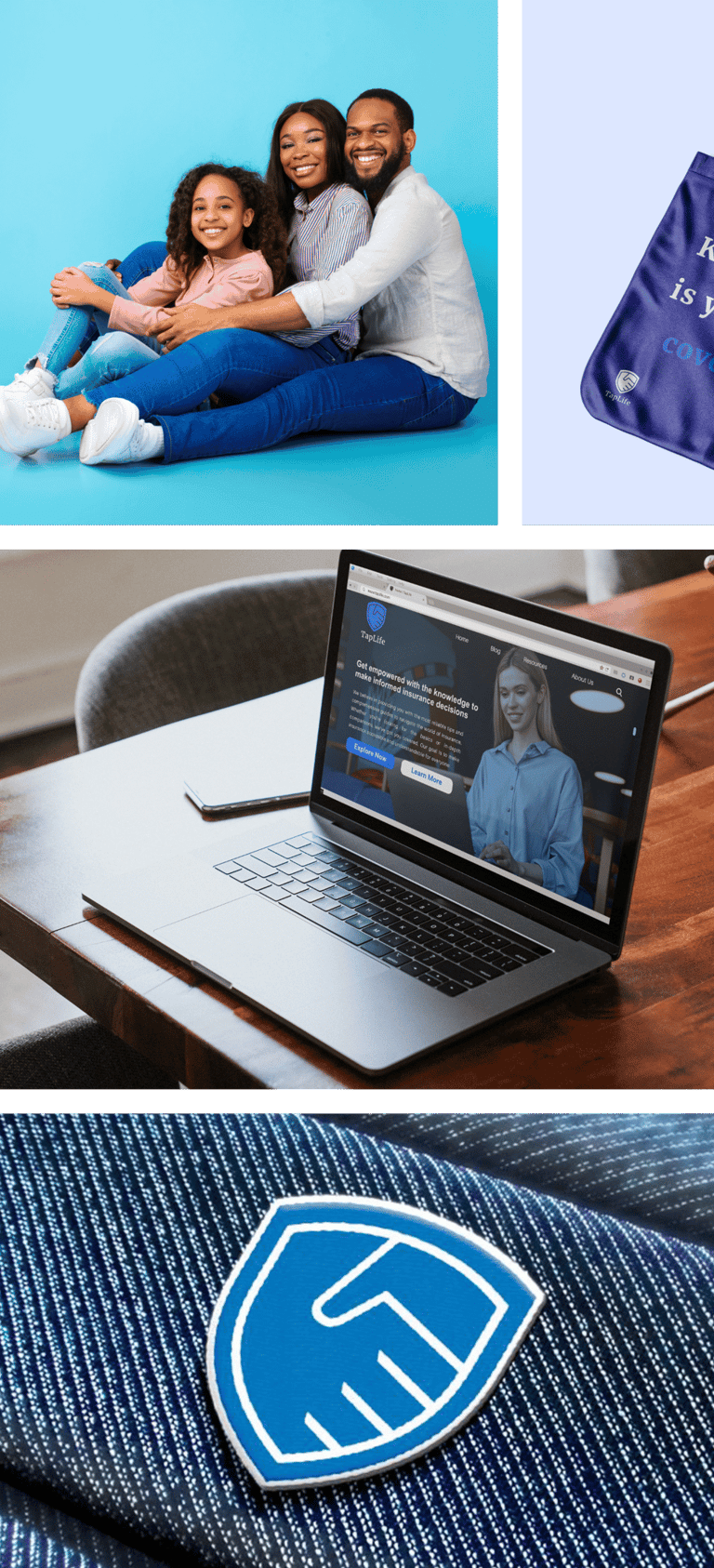
This marks the application of TapLife’s new brand identity across all brand materials, including corporate items such as letterheads and business cards, as well as marketing tools like banners, posters, and digital platforms. This consistent use of design and tone allows audiences to see TapLife as a clear, unified brand. By maintaining a steady visual style and voice, TapLife strengthens its communication and builds stronger trust with its community.